
Visualizing Home Price Changes
Sometimes you need an interactive graphic

Like the map shown below? The free interactive version lets you zoom into any ZIP code and toggle between price levels and changes (measured over horizons from 3 months to 15 years), among other features. Did I mention it’s free?
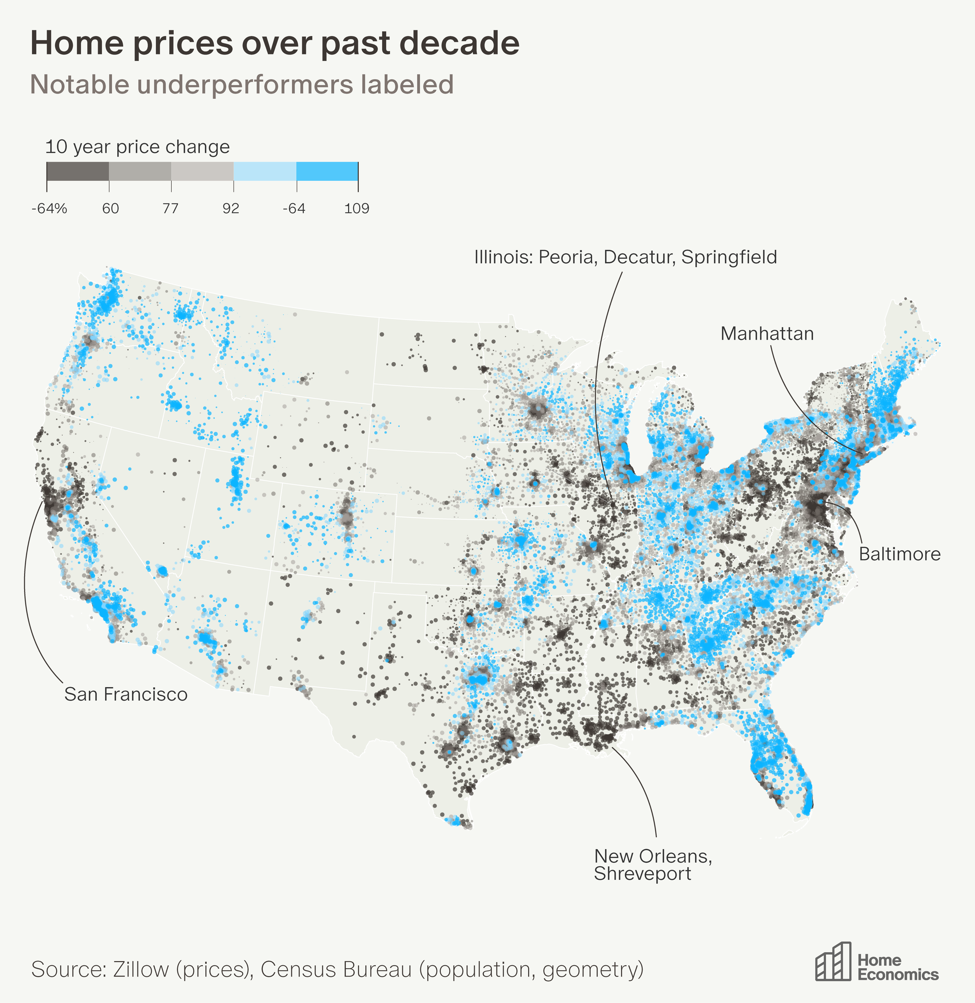
For the median American ZIP code, home prices have doubled over the past decade. The map below shows 10-year price changes across 22,000 ZIP codes. Each dot represents a ZIP code and is sized by population. Clusters of dots represent dense cities. Brighter blue means more appreciation; darker means less. I’ve labeled some of the notable underperformers.
This map is unconventional, for good reason. Conventional maps have two related problems.
The first is that geography and population are often inversely proportional—Wyoming is enormous but has fewer residents than a single Brooklyn ZIP code. A colored map gives Wyoming far more visual weight.
The second is subtler: even if you fix the geography, you can still mislead by plotting a number instead of a rate. A map of “PhDs by county” is really just a population map; New York will always dominate, even if its PhD share is unremarkable. Both problems cause the same distortion: the map draws your eye to the wrong places.
The bubble map above addresses both. Each dot is a ZIP code, sized by population—so dense metros form visible clusters while rural areas recede. And because each dot is colored by a rate (percent price change), a small town and a large city with the same appreciation look the same color.
But even a well-designed static map can only show one view of 22,000 ZIP codes. Most of the time, an interactive chart is a sign that the author couldn’t figure out the one thing worth highlighting—but sometimes you really do need it. You can use the interactive version of this map here.